How to Prepare a Manuscript for Editing: MS Word
We write in so many different ways. On our phones, in notebooks and on scraps of paper, on our laptops—you name it! Your process is your process, and whatever you need to do to get your story out is what you need to do. But when you’re ready for an editor a few simple pre-editing steps will help ensure a smooth process for everyone involved.
#1. SAVE AS A MICROSOFT WORD FILE
Whether you write using Microsoft Word, Google Docs, Scrivener, or any other software, for a professional edit (and smooth production process) Word remains the best program for the job. Although somewhat notorious for the odd glitch, Microsoft Word is made for word-processing. It has been used by publishing and editorial professionals for decades, and as a result, there are numerous add-ons that aid us in doing our job. These invaluable tools of the trade are simply not available elsewhere.
If you’re self-publishing and working with multiple editors, using Word will help all parties maintain consistent files and can save you a lot of headaches with workflow. Also keep in mind that every major self-publishing platform requires you to at least upload your work as a formatted Word document. (Although a PDF is recommended to help avoid introducing errors during the conversion process; this is included in my Ready to Publish package.)
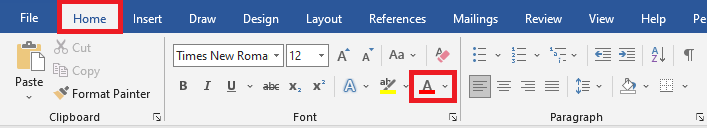
#2. SET TO STANDARD COLOURS
If some strange combination of font and background color worked for you while writing, great! But to avoid giving your editor a headache, switch back to a white background with black font.
To change the font color, go to the Home tab, and in the Font section, click the arrow beside the button with the capital A and a red line beneath.
To change the background color, go to the Design tab, and in the Page Backgroud section, click the arrow beside Page Color.


#3. SET FONT TO TIMES NEW ROMAN
When editing, design is irrelevant. What matters now is the text itself, and not how it is to appear in its final, printed form. A serif font, like Times New Roman, is easiest on the eyes … and so the easiest to read for long periods of time. Similar fonts may work (like Adobe Caslon Pro, this font!), but keep in mind that the font you use affects the shapes of letters and the way in which things like apostrophes, commas, and dashes appear. Consider these examples:
This is hard to edit.
And so it this.
Yes, even this.
Please, no!
Neope.
Did you spot the typo in the last line? Using alternate fonts can make certain errors harder to spot when editing, thus increasing the likelihood that mistakes remain. If the font or text treatment does need to be altered to suit the story, make a note so it can be applied at the design and production stage.
To adjust the font, click on the Home tab. In the Font section, set the font to Times New Roman and the font size to 12.

#4. ADJUST LINE SPACING
Double-spaced is somewhat standard, although I find 1.5 spacing works just as well. But please no single spacing!
Again, this is for simple visual considerations. You don’t need to worry about page count at this stage, as the text is not yet finalized and there is no way to know how many pages the final product will be. That said, you—and your editor—should know the average word length for your intended audience and edit with this in mind.
To adjust line spacing, first click on the Home tab, then under the Paragraph section, select the little arrow in the bottom right-hand corner.

This will open the Paragraph dialogue box, which defaults to the Indents and Spacing tab. Under the Spacing heading, navigate to the drop-down menu under Line spacing and set to 1.5 lines (or Double). Press OK.

#5. REMOVE MANUAL TABS
Raise your hand if you’ve ever hit the Tab key to indent a paragraph. *Hand inches up.*
It was likely you were taught to do so, as I was! But with the advent of ebook technology, creating your own formatting, so to speak, increases the chance you will have trouble uploading to online publishers.
Locate manual tabs by clicking on the pilcrow (¶) button under Paragraph on the Home tab.
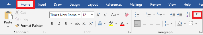
Once you do so, a little arrow will appear before each paragraph that has been indented manually.

To remove, you simply delete the little arrow … and then set the indent within the Paragraph dialogue box. Once the dialogue box is open, under Indents and Spacing, go to the second heading: Indentation. Under Special, select “First line” from the drop-down menu. Word will default to a 1.27 cm indent (as shown), but you can change this to suit your preference. (I do recommend, however, it be no less than .5 cm.) Click OK.

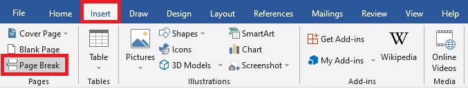
#6. ADD CHAPTER HEADINGS AND PAGE BREAKS
Chapters always start on a new page. But sometimes, especially during revision, text creeps upward and suddenly Chapter 7 starts on the same page Chapter 6 ends. Again, raise your hand if you’ve ever hit Enter a bunch of times to bring the chapter back down to a page all on its own …
You’re in good company! But this is not only inefficient when working with an editor, like manual tabs it can affect the look of the final product or make formatting in Word, or another program, more of a headache than needed.
Easily navigate the document by applying chapter headings. In the manuscript, simply highlight each chapter title or heading, then select Heading 1 under the Styles section on the Home tab.

Once the style is applied, the chapter heading will appear as below. (You can edit the styles to appear how you wish, but that’s too much for this post!) The stylized text also appears in the Navigation pane, which you and your editor can use to quickly and easily navigate the document.

Applying styles, however, will not automatically make a new chapter start on a fresh page. (Although this is another thing you are able to modify, if so inclined.) If you’re not ready to mess around with styles, there is another way!
To add a page break, place the cursor at the end of the last sentence of the chapter. Go to the Insert tab, and under the Pages section click Page Break. This will force all the text after the cursor to the next page. No matter how much the text moves around during editing and revision, Word will automatically adjust so everything stays neat and tidy.
#7. REMOVE PAGE NUMBERS AND HEADERS
Many clients submit work with their name and book title in the headers, and numbers already entered in the footers. I understand this looks more official, but again this is more of a concern for the production and design stage. (And remember, ebooks don’t need page numbers!) There are specific guidelines for these elements that concern a proofreader, who looks at the text in its final, ready-to-print format.
During a developmental edit or a copyedit it’s not the end of the world if they are included, but consider how you and your editor will refer to corrections or areas of concern: will you reference the page numbers you’ve included, or those Word automatically adds in the left-hand corner of the screen?
To remove page numbers and headers, double-click next to one to open the Header & Footer tab, then simply select the text and delete. This should apply to the whole document unless you selected “Different First Page” or “Different Odd & Even Pages” when inserting them.

YOU’RE DONE!
I hope you learned some useful tips that not only help immensely with the editing process, but that will help make your writing life a little smoother as well!
Do you absolutely *have* to do all this before you send your book to an editor? Not likely, but it depends. Some freelancers may have specific submission requests, which you should always respect. Submitting an edit-ready manuscript can increase turnaround time and ensure a more thorough edit. It may even save you money for those who work at an hourly rate, as wrestling with formatting concerns will slow them down and add to the overall time spent.
If you do really want—or need, based on accessibility—an editor to do any pre-editing work, make sure this is communicated up front. I know myself, and many others, are more than happy to help!
Questions? Drop them below. And, until next time, keep creating,

(Post photo by Heather Savard Photography)